Case Studies Orders Doubled in a Month: Rebuilding Quality Jewelry & Apparel
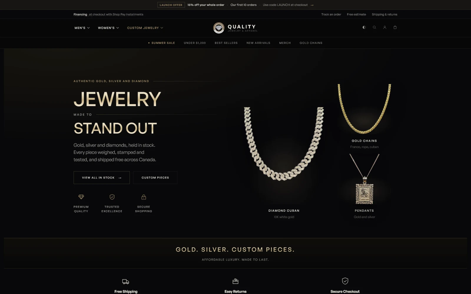 After
After
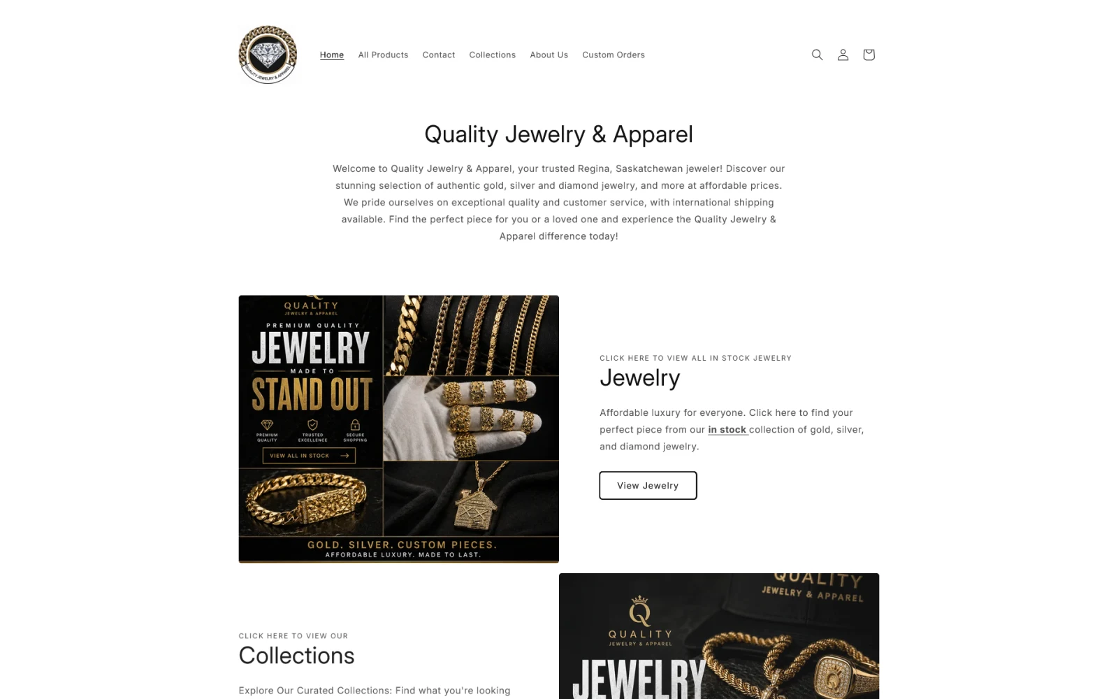 Before
Quality Jewelry & Apparel is a Regina jeweller with real gold behind the glass. 10K chains by the foot, certified diamond studs, nugget rings, custom pieces built from a sketch. The product was never the problem.
The storefront was. A $350 pair of earrings and a $7,250 Cuban chain sat in the same alphabetical list, twelve pages deep. In the first full month after the rebuild, orders doubled.
The situation
The old site was a stock theme doing what stock themes do. It worked. Nothing was broken. That made it easy to leave alone.
The homepage opened on a welcome paragraph and two banners. You had to scroll past all of it before a single price appeared. The menu listed “All Products” and “Collections,” which is the same thing said twice. Behind both sat one grid with no filters: no metal, no length, no price bracket. Page one showed a $5,000 diamond pendant next to $350 ball earrings because that is where the alphabet put them.
A catalogue is not a storefront. Showing someone everything you own is not service. It is a decision you made them take alone.
The real problem: two buyers, one door
A jewellery shop like this serves two completely different people, and the old site gave them both the same entrance.
One wants a $350 piece today. They are on a phone, they want to see the price without asking, and every extra tap is a reason to close the tab. The other is spending five figures. They are not impulse-buying a Cuban chain. They want the weight, the karat, the stamp, and some way to pay for it that is not the full amount up front.
Ask the first one to scroll twelve pages and they leave. Give the second one nothing but a “Buy it now” button on a $7,250 listing and they leave too. Both were landing on the same flat grid and doing the sorting themselves.
What we did
We rebuilt the storefront around those two paths instead of around the catalogue.
- Put the inventory above the fold. The homepage now opens on what is actually in the case, not a paragraph introducing the business to people who already know who it is.
- Sorted the case by how people shop. Men’s and women’s across the top, then chains, rings, pendants, bracelets, earrings and wedding. Filters for metal (10K, 14K, white gold, sterling silver) and price brackets that say the quiet part out loud: under $250, under $500, under $1,200, and $5,000 and up.
- Published the specifics. Every chain shows its weight, karat, colour and length. The questions that used to arrive as messages are answered before anyone asks.
- Answered the money questions at the price. Free Canada-wide shipping on every order, no minimum, tracked to the door. Instalments at checkout. Graduate Gemologist appraisals on the premium pieces. None of it buried in a policy page.
- Gave custom work terms up front. Bring a drawing, leave with a quote. The estimate is free and in writing, the metals are listed, a deposit starts the job.
- Made the shop look like the product. Dark, gold, shot on actual stock. A luxury item on a white default theme reads as a dropshipper no matter how real the gold is.
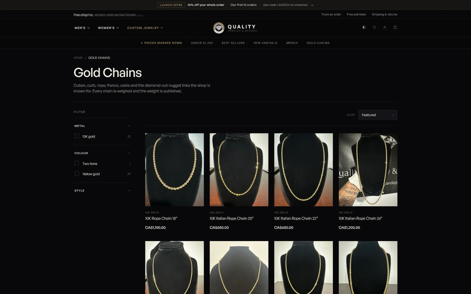 After: gold chains
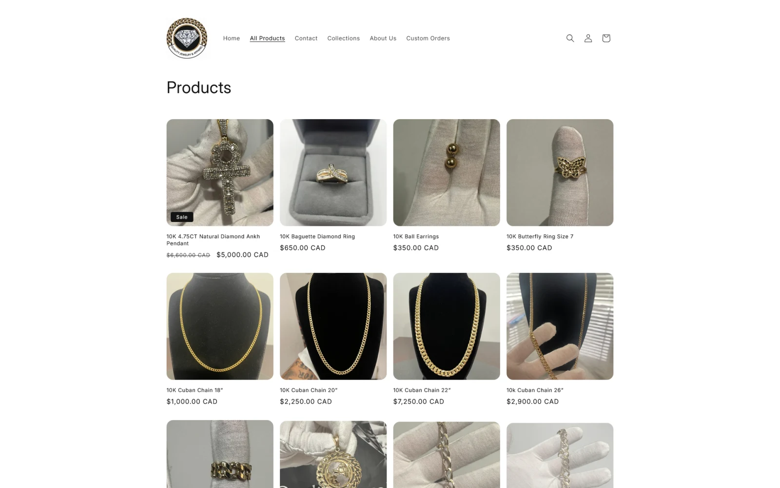 Before: all products
The path for the $350 buyer
They land, see stock, tap “Under $250,” see a price and a photo of the real thing, and check out. Free shipping and the returns policy are right there. Nothing about that journey requires the shop to be open.
The path for the $7,250 buyer
They take longer, and the site lets them. Weight and karat on the listing. An appraisal on the premium pieces. Instalments spelled out at the price. A custom route if what they want does not exist yet. And one thing most stores cannot claim: most of the case is one-of-one, and the site says so. When the reason to decide today is true, printing it is not a tactic.
The high-ticket sale often still finishes with a conversation. It now starts from a customer who already trusts the shop.
The result
Orders doubled month over month. Same owner, same inventory, same photos, same city. Traffic did not double. The storefront stopped losing the people who were already showing up.
Nothing new was added to the business. The rebuild stopped filtering out buyers at the door in both directions: the quick sale that could not find a price, and the serious one that could not find a reason to trust.
What this means for your business
If you sell more than one thing at more than one price, your site is making this sorting decision whether you have thought about it or not. A single undifferentiated list tells every visitor they are the same visitor. Sort them on purpose and the same traffic produces more orders because fewer people give up.
Leave it alone and nothing dramatic happens. There is no error message for a storefront that quietly under-converts. The orders that never happen leave no trace. The shopper who could not find the price never tells you. The big spender who was not sure you were real just does not come back.
There is also a cost showing up on your phone, not in your analytics. Every “do you have this in 22 inch,” every “what does it weigh,” every “is this real gold” is a question your storefront should have answered. Publish the specifics and the volume drops while the quality of the conversations goes up.
If you are not sure which of those describes your site, we have written up how to tell a traffic problem from a conversion problem. Or see how we approach website development, and book a free Growth Session where we will map the paths through your site the way we mapped these two.
Want This Handled?
Book a free Growth Session. We audit what you have now and map exactly what it takes to grow, whether you hire us or do it yourself.
Get My Free Growth SessionKeep Reading
All posts →
Millions of Views, Then Actual Sales: Mindful Singers
Jordan was selling every hour he had. Growth had to come from somewhere other than his calendar.

A Full Catalog Without the E-Commerce Headache: Mike’s Home Centre
Dan had a big catalog and no interest in becoming a full-time e-commerce operator. Most agencies would have sold him a store.

From Dead Link to Digital Storefront: Residential Building Services Ltd.
They were paying for hosting every month and sending every prospect who looked them up to a dead link. Here is what we built instead.